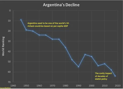
I've written about Argentina's terrible struggles in the grip of Peronism, which Steve Hayward here defines (accurately) as populist socialism. And he follows that definition with a chart that shows graphically how bad Peronism has been for Argentina.
 Which explains why Argentines did not vote to retain the incumbent Peronist political movement. The blue line starts when Juan Peron became Argentina's President.
I believe it fair to compare Argentina's doomed love affair with "populist socialism" to an addiction. The election of Milei may signal they have finally "hit bottom" and be ready to attempt his version of a 12 step program.
Afterthought: You could relabel that chart as the decline of California over roughly the same time period and be darned close. It parallels how I, born in CA and resident there until roughly 2000, have experienced CA's decline. It's felt like what Hemingway had a character say about how he went bankrupt, "gradually and then suddenly."